I really enjoyed creating these posters as i got to go quite wild because of the theme we had in place which was 'Club to Catwalk' which had to be designed in the 80's style. This i first thought was going to be a challenge but once i started my research it all started to influence me which helped bring some 80's creativity to mind.
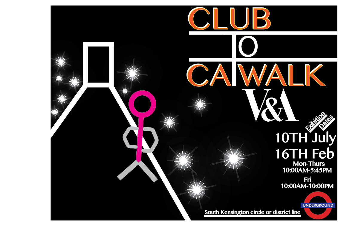
Here is my first final digitally designed poster produced in illustrator with the influence of Jasper Goodall. Here i first started off with a solid plain black background so that everything i added had perfect clarity and stood out easier. I then dropped in my illustration of the catwalk which was made from the shape tool on the left hand side as shown in my design sheets while keeping the colours closely related to Jasper Goodall. I then went on to making the camera flashes which was made with the shape tool and then crinkled to get the flash effect. I added glows and shadows to make the flashes look bright and then copied and pasted them into position while only scaling them larger or smaller. I then went on to making the title 'Club to Catwalk' and placed it and the top right. This i feel looks creative as i joined up two 'T' while stretching the top part of it along and off the poster to create part of a catwalk. I added a white shadow to 'Club' and 'Catwalk' to make it stand out while the colour orange of the title will help draw attention. The last thing i added was the information which i placed and the bottom left. This included the V&A logo, exhibition dates, open and close times, underground logo and stations closest to the exhibition. This was all in the colour white because i feel that this colour on black really stands out and is easy to read. Overall i feel that this poster didn't have much artist influence as it could have however it fits the 80's theme well as i used colours that inspired me from the V&A exhibition. It also has great creativity that flows and stand out on the page which makes this succsessful.

Here is my second final digitally designed poster produced in illustrator with the influence of Peter Saville. Here i first started off with a solid plain red pink background so it bounces out and catches the eye while giving it a glam look. I then placed my illustration of the three tapes which were made with the shape tool on the right had side of the page as shown on my design sheets. I coloured these white, orange and black because these were the colours i was influenced by from the V&A exhibition and also look bright which helps them to stand out. I then added the title 'Club To Catwalk' on the left in the center of the page which was scaled largely and made bold so it was the main icon of the poster. I used the colour black for 'Club' and 'Catwalk' because i feel its a bold colour that stands out on the background its on top of. This had a solid shadow added which was coloured white and it goes well with the black which helps the title look attractive. I used the colour white instead of black for 'To' because i felt that making it white would keep it bright and attractive while the black looking calm and bold just like the outfits of an 80's catwalk. This had a solid orange shadow which helps it to look attractive on the page. I then went on to making labels which i placed around the edges of the page, around the letters and inside the letters. I made these with the rectangle tool while changing the stroke to a rough edge to give it that real label look. These were all in the colours of the 80's style which i saw in the V&A exhibition which look bright while some were in the colours of my artist of influence which was Peter Saville. Two lables had designer logos placed on such as Nike and Levis which were created with the pen tool by drawing over the real logo which i got from Google. After adding lables i then created sparkles by using the circle and star tool to add a glamorous look. I added gradient colour to the circle to get the bright glow while adding a faded shadow with low opacity to create a spreading glow effect. I copied and pasted these amd put the next to each other while only changing the size. The last thing i added was the information which unlike my other poster it was scattered around. This included the V&A logo, exhibition dates, open and close times, underground logo and stations closest to the exhibition. This was all in the colour white because i feel that its an easy colour to read on a background like this. Overall i feel that this poster has too much going on because of all that's on the page however it looks creative and stands out because of all the amazing colours used.
No comments:
Post a Comment